
Innovative Web Design Techniques That Transform User Experience
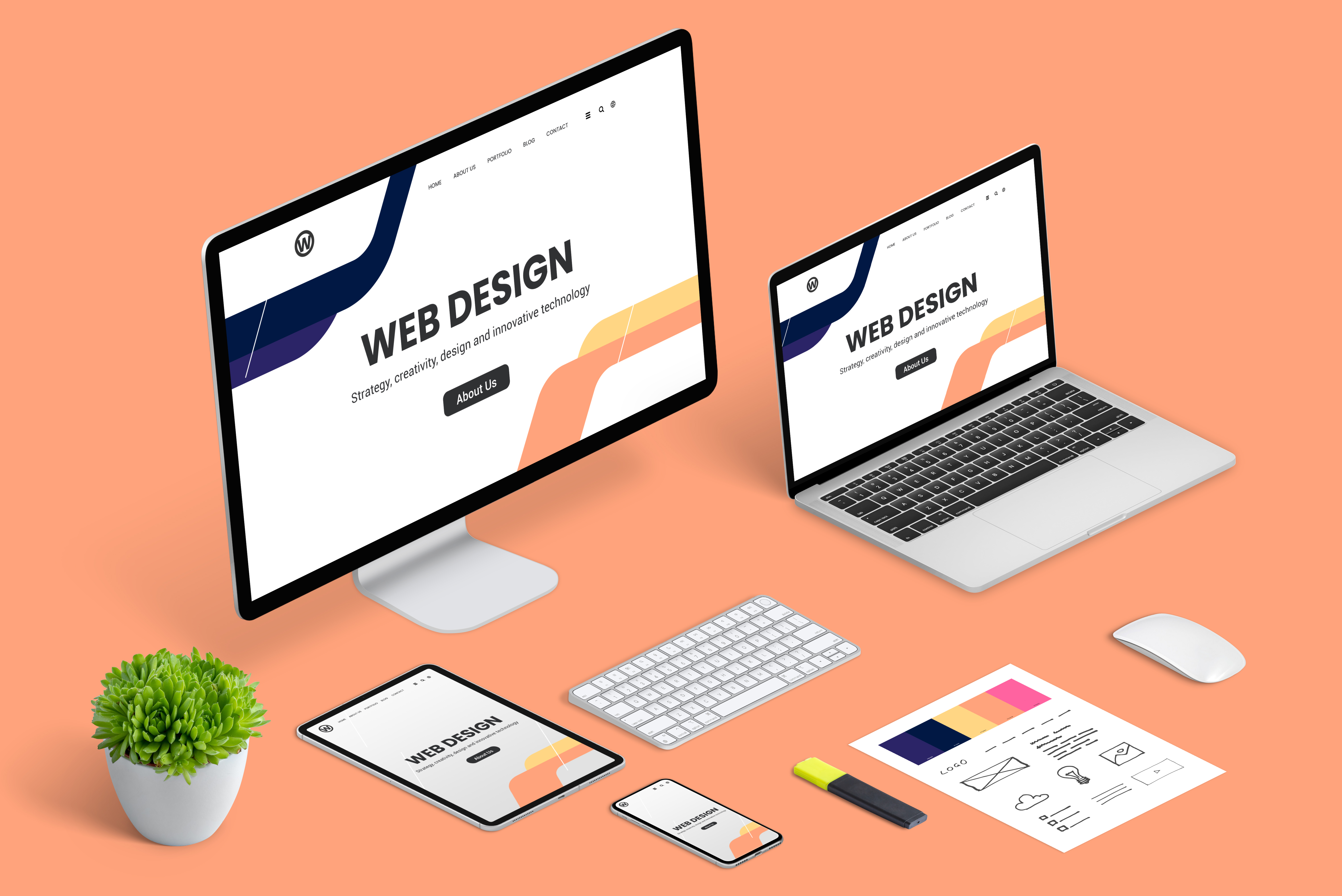
Forget everything you know about web design being just about looks. Your website should work harder—welcoming visitors with smooth navigation and clear messaging that keeps them coming back. With innovative web design focused on user experience, you can build a site that not only looks great but also drives real results. Let’s explore how smart techniques can make your site responsive, ADA compliant, and SEO-optimized to grow your business online.
Responsive Design Techniques

In today’s digital age, ensuring your website looks great on all devices is crucial. This is where responsive design comes into play, starting with a mobile-first approach.
Mobile-First Approach
Why begin with mobile? Most people now browse the web on their phones. Starting with mobile design ensures your site is accessible to the largest audience possible. By focusing on smaller screens first, you naturally prioritize the most important content, which helps in delivering a clear message. This method is about stripping away the non-essentials and highlighting what truly matters to your users.
Imagine a small business owner looking to attract local customers. A mobile-first site ensures that their contact information and services are front and center for users on the go. This approach leads to a seamless transition to larger screens, providing a consistent experience. Remember, if your site functions well on mobile, adapting to larger devices becomes much easier.
Fluid Grids and Flexible Images
Let’s talk about fluid grids and flexible images. These aren’t just fancy terms— they are key components in responsive design. A fluid grid adapts to the size of the user’s screen. Instead of fixed measurements, it uses percentages. This ensures that your site always looks its best, no matter the device.
Flexible images work hand-in-hand with fluid grids. They adjust automatically to fit within the grid, avoiding awkward cropping or oversized visuals. This is crucial for maintaining the integrity of your brand’s imagery. If your business heavily relies on visuals, like a design studio showcasing its portfolio, this method ensures that every image is displayed perfectly.
Enhancing Accessibility

Design isn’t just about visuals; it’s also about inclusivity. Making your site accessible means welcoming more users and potentially increasing your audience.
Understanding ADA Compliance
ADA compliance isn’t just a buzzword—it’s a necessity. Ensuring your site meets accessibility standards opens the door to a broader audience, including those with disabilities. Imagine a potential customer who can’t use a mouse. They rely on keyboard navigation. Your site should cater to them too.
Compliance involves several factors, such as providing text alternatives for images and ensuring that your site’s navigation is logical and predictable. Start by reviewing your site’s current accessibility and identify areas for improvement. Remember, a compliant site not only serves your audience better but also positions your business as inclusive and forward-thinking.
Tools for Better Accessibility
There are several tools available to help you enhance your site’s accessibility. Tools like WAVE or Axe can identify issues and suggest improvements. These tools offer insight into your site’s accessibility, making it easier to implement necessary changes.
Consider a local café looking to improve its online ordering system. By using these tools, they can ensure that all customers, regardless of ability, have a smooth ordering experience. Incorporating these tools into your design process ensures that your site serves all users effectively, increasing engagement and satisfaction.
SEO-Optimized Web Strategies
Once your site is responsive and accessible, it’s time to focus on SEO to boost visibility. A well-optimized site ensures that your business stands out in search engine results.
Importance of SEO in Web Design
Why is SEO crucial? A well-designed site that’s invisible to search engines won’t drive traffic. SEO helps bridge this gap. It’s about more than just keywords; it’s about structuring your site so search engines understand and rank it.
Consider a small bakery that wants to attract more local customers. By optimizing their site, they can appear in search results when people look for “fresh bread in [city].” This targeted visibility can drive significant foot traffic to their store. SEO is about connecting with potential customers right when they’re searching for what you offer.
Effective Use of Keywords
Keywords are the backbone of SEO. But it’s not about stuffing them everywhere. It’s about using them naturally in your content. Start by researching what terms potential customers use to find businesses like yours. Tools like Google Keyword Planner can be helpful here.
For example, a yoga studio might find that “yoga classes near me” is a common search. By incorporating this keyword into their site, they can attract more local clients looking for classes. Using keywords effectively means integrating them into your content in a way that reads naturally and enhances the user’s experience.
In conclusion, combining responsive design, accessibility enhancements, and SEO strategies can transform your web presence. By focusing on these areas, you ensure that your website not only looks great but also reaches and serves a wider audience. Remember, the longer you wait to implement these strategies, the more potential customers you might miss. Prioritize these steps today and set your business up for online success.